© 2026 maxciti. All Rights Reserved
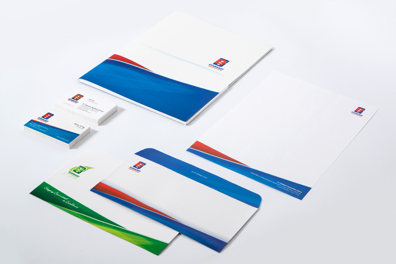
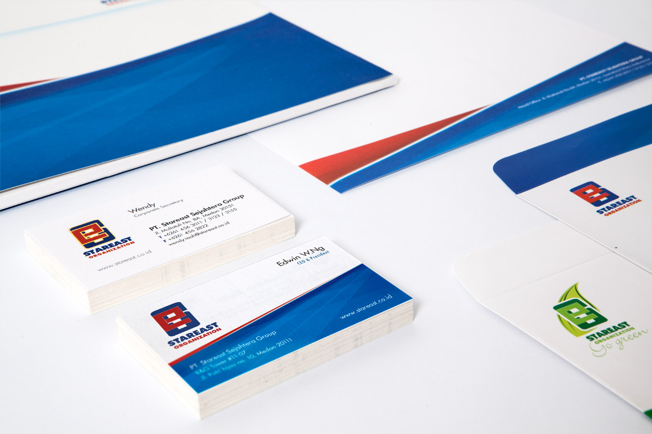
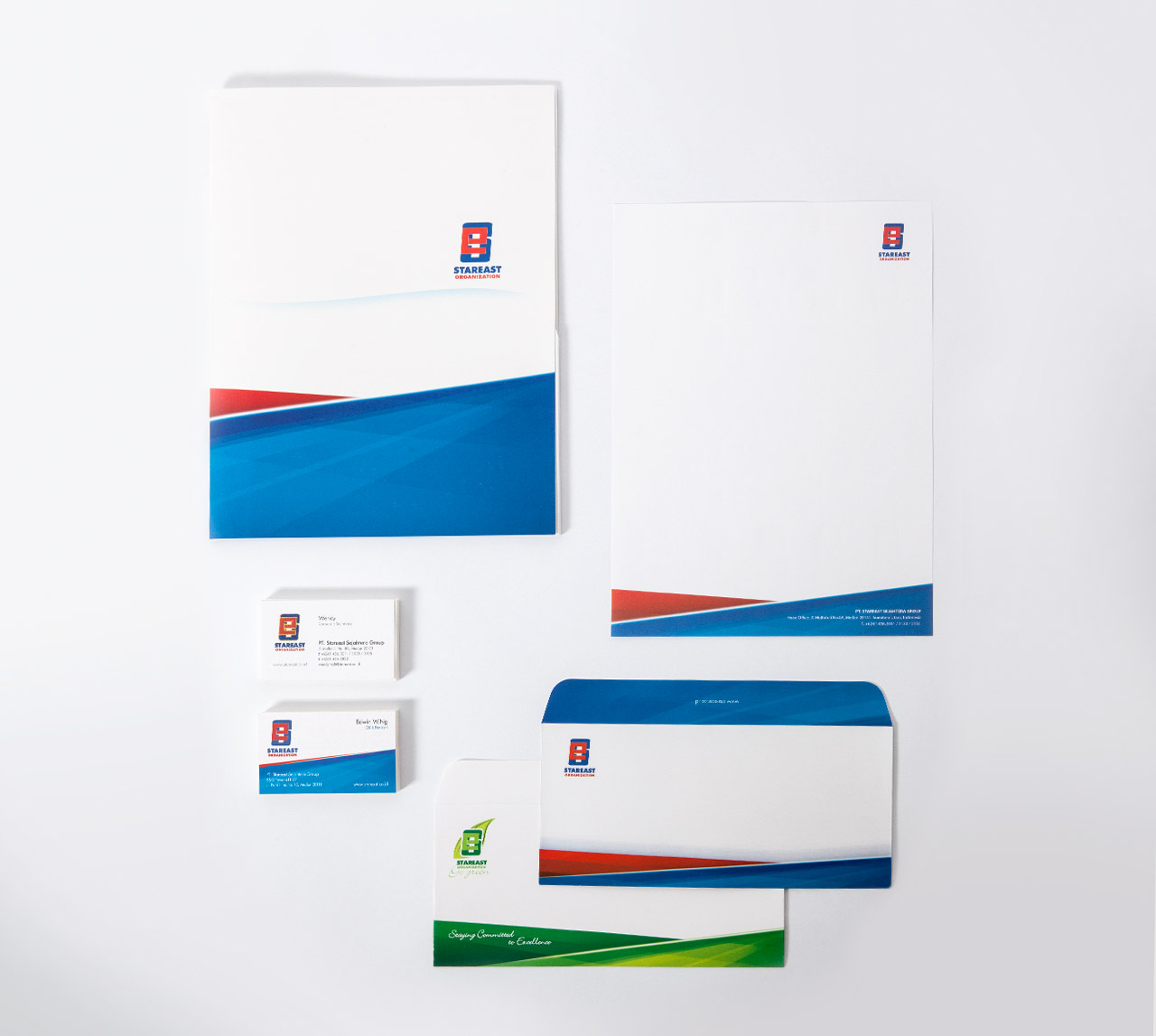
Working with an existing logo from Stareast, we focus on creating a consistent stationery to its cooperate identity. Borrowing another color coordination from the logo, we expand the primary color into its design; Red & blue for the main logo and fresh green for their environment friendly company extension.
WORKS


Kinerja Pay is an online payment system for merchants/ vendors. Convenient systems such as Kinerja Pay is believed to be the future of how our society works. However, with the newness of it, the marketing campaign we helped launch has to be consistent and memorable.
A renowned old brand in town, Asia Jaya has long established its presence as a major supplier of baking and food ingredients. Maxciti approaches its logo with green color as it represents freshness and source of life, in this case: food.
Originally a flash-based website, Motif8 was built in 2008 and recently is turned into a html-based website for mobile viewing purpose.
We design 2 ( two) main items for Nata – a professional make up artist based in Medan- : Business card and a flyer containing redeemable voucher.
As one of the most sought after bridal & photography vendors in Medan, Brides on 22 always adapts to the ever changing world of bridal and photography trend. One thing remains in their concept though and that is passion with a blend of simplicity and elegance.

